Graphic Design
Project: Logo Design
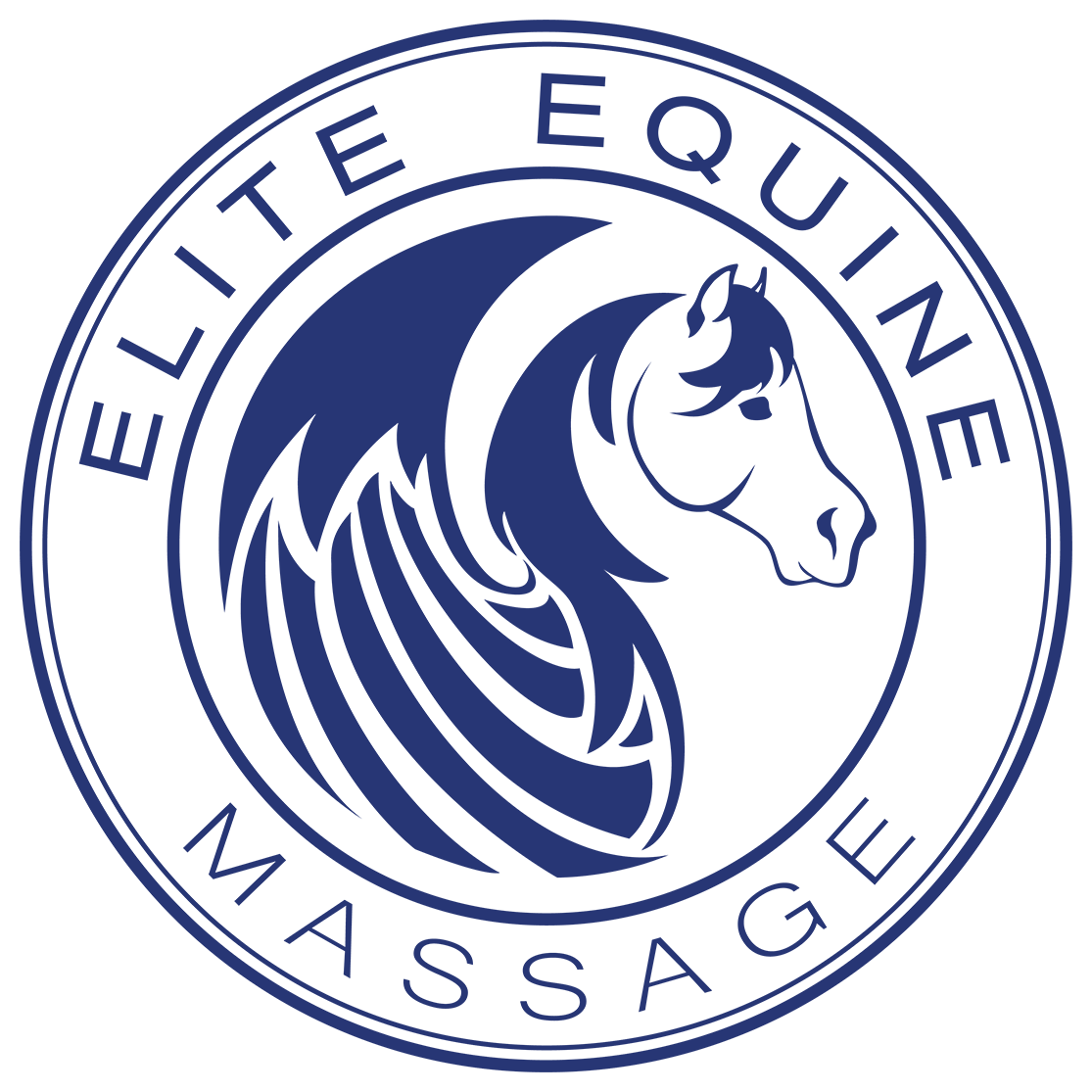
Client: Elite Equine Massage, LLC
Software: Adobe Illustrator
the Brief:
Create a logo for New England based equine massage therapist that was clean, simple and professional.
Preferences:
- Outline styling
- Natural flowing movement
- Black and white
Solution:
I had a lot of fun working on this design. I had just completed three human massage therapy logos. Horses are my specialty, however, and I was delighted when Rebecca Upham-Davis approached me to create her logo for her equine massage business. The ideas would not stop coming and quite a few were sketched out before ultimately deciding on this one. When I showed it to Rebecca my exact words were "it's not a sport horse, but you can't get much more elite than Pegasus." She agreed.
Motion was captured in the gentle unfurling of the wings. I pulled down sections from the mane and applied a gentle curve to give additional movement. At first, I tried the entire logo in an outline, but found that the balance was thrown off due to the size of the wings. Instead, I limited the outline to the horse head, and blocked in the eye and nostril. Rebecca put her trust in my design skills one more time when it came to color. She informed me that main color on her website would be blue. After discussing it with her, I applied it to the design as an alternative. Changing colors in Illustrator is a two-second process, but as you can see it can make all the difference.